 하나씩 점을 찍어 나가며
세련된 데이터 시각화 패키지, Plotly.
matplotlib, seaborn 만 사용하다가, 최근에 훨씬 세련된 데이터 시각화 툴을 찾았습니다.
plotly 인데, 웹 시각화 라이브러리인 d3.js 를 이용하여 보다 interactive 하게 그래프를 만들어줍니다.
그만큼, 굉장히 잘되어있고, 앞으로도 많이 발전할 라이브러리라는 생각이 듭니다.

예를 들어, 다음과 같은 그래프를 만들 수 있습니다.
data = pd.Series(range(10))
data.iplot(kind='bar', title="제목", xTitle="x축", yTitle="y축")
코드만 봐도, matplotlib 보다 훨씬 간결함이 보입니다.
시각화 된 그래프 역시 훨씬 세련된게 느껴집니다.
또한, 우측 하단 Export to plot.ly 링크를 누르면, 좀 더 커스텀할 수 있도록 도와줍니다.
데이터를 시각화하여 발표하는 입장이라면, 굉장히 유용한 기능입니다.
이전까지는 발표에 넣을 이쁜 그래프 만들려고 코드로 이리저리 볶았으니까요.
이번 글에서는, plotly 를 pandas 와 더불어 쉽게 사용하는 법을 소개합니다.
크게 두 가지 방법이 있는데, 다음과 같습니다.
cufflinks설정과.iplot()을 통해,pandas.plot()과 같이 pandas 데이터를 바로 시각화 할 수 있습니다.- plotly.express 라이브러리로, seaborn 패키지와 같은 형태로도 사용가능합니다.
그럼 이제 각 방법과 예제를 하나씩 살펴보겠습니다.
1. cufflinks + iplot() 사용하기
개인적으로 가장 좋아하는 방법입니다.
사실, 이전에 데이터를 시각화할 때도, pandas.plot() 을 이용하여 pandas 데이터를 바로바로 시각화 하는게 제일 편했거든요.cufflinks 를 이용하면, 신기하게도 plotly 도 이와같은 방법으로 사용가능합니다.
1.1. 설치
다음의 명령어로 먼저 두 패키지를 설치해줍니다.
plotly 의 경우, 포스팅 시점 4.1이 최신버전이지만, 내부 패키지 변동으로 cufflinks 와 호환이 되지 않더군요.4.1 전 단계인 3.8.1로 받아야 제대로 연동됩니다.
pip install plotly==3.8.1
pip install cufflinks
[2020.2.29 수정사항]
현 시점 cufflinks 가 0.17 로 업데이트 되면서 plotly.4.2 + 버전도 모두 지원하게 되었습니다.
기존에 사용하셨던 분들은 plotly, plotly_express, chart_studio, cufflinks 모두 제거했다가 다시 설치해보시길 바랍니다.
pip cufflinks 만 받으셔도 나머지 라이브러리를 모두 같이 받을 수 있습니다.
제 로컬 기준 동작하는 버전 정보는 chart-studio-1.0.0 cufflinks-0.17.0 plotly-4.5.2 입니다.
1.2. 패키지 로드
# - Standard plotly imports
import plotly.plotly as py
import cufflinks as cf
cf.go_offline(connected=True)
1.3. 예제
아래 링크 내용 중 일부만 가져와봤습니다.
보다 구체적인 내용은 아래 링크를 보시면 됩니다.
Cufflinks in Python
https://plot.ly/ipython-notebooks/cufflinks/
1) Line Charts
df = cf.datagen.lines()
df.head()
df.iplot(kind='line')
2) Bar Charts
df = pd.DataFrame(np.random.rand(10, 4), columns=['A', 'B', 'C', 'D'])
df.head()
df.iplot(kind='bar')
df.iplot(kind='bar', barmode='stack')
df['A'].iplot(kind='bar')
df.iplot(kind='barh', barmode='stack')
df['A'].iplot(kind='barh')
3) Area Chart
df.iplot(kind='area')
df.iplot(kind='area', fill=True)
df.iplot(fill=True) # default kind = 'scatter'
그래프의 종류는 다음과 같습니다.
scatter
bar
box
spread
ratiom
heatmap
surface
histogram
bubble
bubble3d
scatter3d
scattergeo
ohlc
candle
pie
choroplet
이 글에서는 대략 iplot() 을 어떤 식으로 사용하는지 감만 잡습니다.
어떻게 생겼는지, 어떤 식으로 시각화 되는지는 위 링크를 통해 확인하실 수 있습니다.
1.4. Plot Styling
이번에는 각 그래프를 좀 더 이쁘게 꾸미는 법에 대해서 정리합니다.
1) Theme
plotly 의 기본 스타일링 테마를 설정할 수 있습니다.
먼저 기본적으로 다음과 같은 테마 스타일이 있습니다.
기본 테마는 pearl 로 설정되있습니다.
이를 하나하나 확인해보겠습니다.
themes = cf.getThemes()
themes
['ggplot', 'pearl', 'solar', 'space', 'white', 'polar', 'henanigans']data = pd.Series(range(10))
for theme in themes:
data.iplot(kind='bar', theme=theme, title=theme)


이 중 하나를 골라, 다음과 같이 셋팅해주면 됩니다.
cf.set_config_file(theme='pearl')2) Layout
글꼴, 글씨 크기 등 레이아웃에 관한 설정은 layout 파라미터로 설정할 수 있습니다.
다음의 예제를 살펴봅시다.
layout = {
    'font': {
        'family': 'consolas',
        'size': 20,
        'color': 'blue'
    }
}
layout['title'] = "Title"

data.iplot(kind='bar', layout=layout)
layout 은 dict 형으로, 그래프의 레이아웃 요소들에 대한 설정 값을 담습니다.
초반에, 일관성있는 스타일링을 위해, plotly theme 설정과 layout 설정을 미리 해둔 뒤,layout['title'] = "Title" 와 같은 방법으로 그때그떄 필요한 레이아웃 값만 적절히 넣어주면 매우 쉽게 이쁜 그래프를 얻을 수 있을 것입니다.
layout의 각 레이아웃 요소는 다음 링크에서 확인하실 수 있습니다.
Python chart attribute
https://plot.ly/python/reference/
2. Plotly express 사용하기
plotly 를 파이썬에서 사용하는 두 번째 방법은 plotly express 를 사용하는 것입니다.
cufflinks 보다 좀 더 다양한 차트들을 제공하고, 사용방법은 seaborn 스럽습니다.
2.1. 설치
pip install plotly_expressplotly 4.1 부터는 별도로 설치하지 않으셔도 됩니다만, 현재 cufflinks 와 호환성 문제 때문에 이 글에서는 3.8.1 을 사용하고 있습니다.
추후 업데이트될 문제라고 생각하지만, 일단은 그 전까지 별도로 설치해야할 듯 합니다.
2.2. 패키지 로드
import plotly.express as px

import pandas as pd
2.3. 예제
예제는 다음 링크중 일부를 가져왔습니다.
보다 자세한 내용은 아래 링크를 참고하시면 됩니다.
Plotly Express in Python
https://plot.ly/python/plotly-express/#plotly-express
1) Scatter Charts
iris = px.data.iris()
iris.head()
fig = px.scatter(iris, x="sepal_width", y="sepal_length")
fig.show()
2) Parallel Coordinates Charts
fig = px.parallel_coordinates(iris,
                              color="species_id",
                              labels={
                                  "species_id": "Species",
                                  "sepal_width": "Sepal Width",
                                  "sepal_length": "Sepal Length",
                                  "petal_width": "Petal Width",
                                  "petal_length": "Petal Length",},
                              color_continuous_scale=px.colors.diverging.Tealrose,
                              color_continuous_midpoint=2)
fig.show()
3) Parallel Categories Charts
tips = px.data.tips()
tips.head()
fig = px.parallel_categories(tips, color="size", color_continuous_scale=px.colors.sequential.Inferno)
fig.show()
튜토리얼과, 라이브러리 요소에 대한 보다 자세한 설명은 다음 Medium Post 를 보시면 좋을듯 합니다.
Introducing Plotly Express
https://medium.com/plotly/introducing-plotly-express-808df010143d
Plotly_express API documentation
https://www.plotly.express/plotly_express/
마지막으로, 이를 종합적으로 설명해주는 다음 포스트를 적극 추천합니다.
The next level of data visualization
https://towardsdatascience.com/the-next-level-of-data-visualization-in-python-dd6e99039d5e
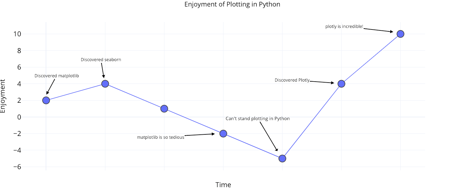
재밌고 공감되는 그림이라 가져와봤습니다.
matplotlib, seaborn 으로 스타일링하는 것에 지치셨다면, 이제는 Plotly 로 손쉽게 시각화할 때인 듯 합니다.
개인적으로, 앞의 두 패키지보다, Plotly 가 훨씬 더 표준화가 되었으면 하는 바램입니다.
'데이터와 함께 탱고를 > 데이터 시각화' 카테고리의 다른 글
| [지도 데이터 시각화] Part 1. Geo Data 와 Python (10) | 2019.11.06 |
|---|---|
| matplotlib.pyplot 좀 더 복잡한 레이아웃 1 (0) | 2019.10.02 |
| pandas, bar 그래프(plot) 이쁘게 그리기 (2) | 2019.06.18 |
| pyplot 그래프의 범주박스 위치 변경하기 (0) | 2019.06.14 |
| folium 의 plugins 패키지 샘플 살펴보기 2 (0) | 2019.06.03 |


